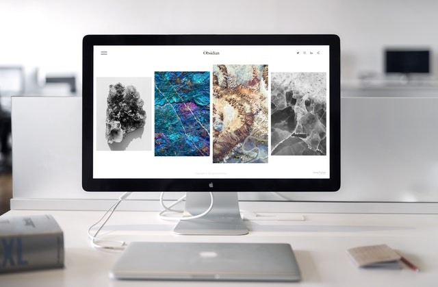
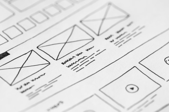
Clean web design that truly stands out from the crowd on a limited budget can be difficult. This is a challenge that most first-time entrepreneurs and small business owners have to face. That’s why it does not come as a surprise that over 36% of small businesses still don’t have a website!
Nonetheless, a clean web design is essential for your company to remain competitive throughout time. This is essential for build a relationship of trust with all of its users. In this case, the right compromise is to invest in a modern, clean-looking, affordable website design.
Some of the benefits of opting for a minimalist website include:
- Fewer maintenance tasks and expenses
- Streamlined UX
- Increased conversion rate
- The focus is kept on content and products
- Better navigation and increased accessibility
- More memorable
Naturally, a minimalist clean web design might not be the best option for all small businesses. But it could also enable you to count on an optimized website for a reduced price. Learn more about affordable website design below or get in touch directly with experienced designers such as WEBX360 to discover a tailored solution.
Use a Limited but Strong Color Palette
Selecting and using the right colour palette and patterns is essential to create the right branding. And, while your brand’s colour scheme should be immediately recognizable on your site. There are a few extra elements to consider when crafting your site’s design.
Aside from taking into consideration the psychology of digital colours , you should also ensure a significant contrast between colours to make your site more usable. In any case, you should not incorporate in your design more than two or three colours.
Add Clear Call-to-Actions
Improving your clean web design is crucial to improve your user experience. In fact, it is your clean web design that will guide your users through navigating your site, making decisions, and taking action. In all this, clear call-to-action (CTA) buttons play a significant role.
These buttons – which can also appear in the form of hyperlinks – need to suggest to the user what actions to take. From “Sign up to our newsletter!” to “Limited offer! Don’t miss out on a free trial!”, there are plenty of options to keep users on your site for longer and discover your offer.

Use Eye-Catching Designs
While you don’t want to create distracting or disrupting images and messages, you might consider implementing innovative design elements.
For example, you could use illustrations or a different website build. In any case, memorable logos, a distinct color palette, and plenty of white space can help you make your message stand out without adding too many distracting elements. You can find eye-catching, innovative design ideas below:
<iframe width=”560″ height=”315″ src=”https://www.youtube.com/embed/0fnXGy5JMmc” title=”YouTube video player” frameborder=”0″ allow=”accelerometer; autoplay; clipboard-write; encrypted-media; gyroscope; picture-in-picture” allowfullscreen></iframe>
Keep Functionality in Mind
A responsive clean web design is a converting website that is able to engage with customers and encourage them to return to your company.
High levels of functionality and responsiveness are not only nice-to-have features. In fact, recent statistics tell us that over 73% of users will leave a website that is not responsive, that does not provide a streamlined user experience, or that takes too long to load.
Additionally, since almost 55% of all internet traffic comes from mobile devices, it is essential that your website remains responsive, accessible, and usable across a range of devices.
Use High-Quality Media
The 2021 State of Video Marketing report shows that an increasing number of businesses (over 86%) use video as a marketing tool, a tool that has now become one of the most powerful ones for marketers across the globe.
In fact, videos allow consumers to learn more about a product, discover the people behind a brand, learn about the company’s mission, or even leverage expert tips offered by a company.
Whatever your message for your audience is, delivering it through videos on clean web design can significantly increase engagement. Make sure to also use high-quality, eye-catching hero images and media throughout your site.

Make It Accessible by All Users
Recent search engine algorithm updates such as Google Web Core Vitals put a greater focus on accessibility – for all users!
In fact, when creating your site, you will need to incorporate accessibility from the initial stages onwards, so that your site is accessible by all, especially 58 million adults that have a disability just in the US. Following the guidelines created by your government for more accessible websites allow your site to be legally compliant, but also competitive and highly usable.
Keep It Cohesive
Keep your message and voice tone cohesive throughout your site. You can create this consistency and continuity through images, videos, text, and CTAs, but ensure that a uniform message emerges from your site – especially if you have opted for a minimalist website that contains limited content.
Ideally, this continuity should also involve your logo, brand palette, and physical patterns you are using for your products and services.
Optimize It for Speed
Website speed might vary depending on your content and services. However, recent Google updates have increased the importance of page loading experience – which has made it essential to keep your website’s loading speed below the two-second mark.
Since you have invested in a minimalist design, you can be sure to have a website that is light and streamlined. Yet, clean backend coding, optimized images, and SEO-friendly practices. This allows you to refine even further the experience offered to your users.

Leverage White Space
Your minimalist site’s white page does not have to be a downside of affordable website design. In fact, by correctly using white space, you can make important information stand out.
Additionally, you can make your logo pop out from a plain background and increase content comprehension by 20%. Lastly, white space prevents fatigue and clutter, ensuring that your users can navigate your site easily, effortlessly, and for longer.
Create the Right User Experience
As you know – and as Google Core Web Vitals confirmed -, UX is essential to increase your conversion rate, rank higher on the SERP, reduce bounce rate, and increase the number of returning customers. Nonetheless, there is no “one-size-fits-all” formula that can help you create the right experience for your unique audience.
Here is where a professional website designer can help you understand the ins and outs. As well as needs and wants, and trends and fads of your target market and create a tailored experience for them.
Find Expert Web Design Advice
The tips above are a great way to create a clean-looking, affordable, and streamlined website for your business. However, since your business’s site will be your company’s storefront. It is essential to invest in a tailored solution. It allows you to portray your organization’s mission, vision, and values. Consult with an expert website designer to discover a tailored option.
The post 10 Elements of a Clean Web Design appeared first on free html design.


0 Commentaires