Hey guys, in this article, we will discuss the 4 best user-friendly luxury hotel websites. So keep reading.
A resort hotel in a lovely setting sounds fantastic. However, if you wish to compete with your competition, words alone will not be enough. In today’s world, having a website design is critical to your company’s success. You’ll have to establish your value to attract clients and boost sales because more individuals search the web to plan their next vacation. The appropriate web design will assist you in accomplishing this goal.
Website designs are an essential element to attract customers for the growth and sales of your business. However, these hotels are indeed luxurious and they have invested a big amount of money on their websites. And not only on their websites, but the hotels themselves are also very captivating hence one needs to be a huge businessman, a lottery winner or born with a golden spoon in order to book a room in them.
Best User-Friendly Luxury Hotel Websites:
4. Le Mirabeau
1. The Adriatic Luxury Hotel

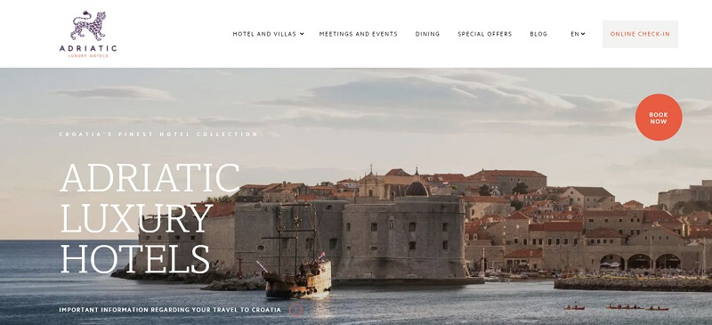
Adriatic hotel essentially has plenty to display both the beauty and elegance of the beautiful city, including its breathtaking beach environs. With its minimalism and plenty of innovative features, the website makes an impression. For example, the website’s front page features a set of professionally filmed video streams that convey the extraordinary experience of vacationing here.
The site’s design reflects the high-end experience offered by all of the resorts in its broad portfolio. The judicious usage of a distinctive introductory video with background music effectively catches the user’s attention and establishes the tone. Its design and layout give a perfectly polished vibe thanks to meticulous attention to each and every component. Furthermore, the site employs bright graphics throughout, emphasizing the luxury of the hotels’ furnishings.
The website, too, has a conspicuous call-to-action button labeled ‘Book Now,’ which displays a translucent overlay that makes choosing entry and exit days from just a calendar a joy! Its simple booking engine then shows information accurately and simply, so when it arrives at room specifics, a gorgeous gliding image gallery effectively relays them.
Finally, this mobile-friendly site includes features such as swipe galleries, quick load speeds, and a site-wide unique ‘Book Your Stay’ option at the end of the site.
In essence, the website efficiently promotes Dubrovnik as an attractive tourist destination.
2. Gramercy Park Hotel

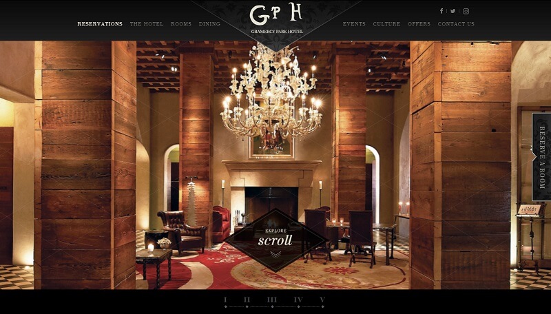
This renowned hotel, one of the most well-known luxury hotels, uses the web to emphasize elegance and refinement. The Gramercy Hotel achieves this by using a variety of dark colors, such as rich red and black, to create an exclusive and elegant atmosphere.
Furthermore, it incorporates a quick reservation booking within its one-of-a-kind photo slideshow, guaranteeing visitors to check the availability right away. As a result, the branding can radiate confidence, knowing it has effectively captivated their target audience, and these people would be strongly driven to book straight away.
3. Casa Angelina

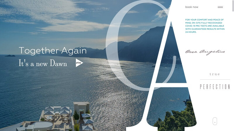
Hotel Casa Angelina is one of the most remarkable cliff resorts globally, situated in the Amalfi Coast hills. In general, it has a great website in addition to its beautiful appearance and excellent services.
The website of the hotel appears white with black and grey lettering. It also has a hamburger menu that employs parallax graphics. But, first and foremost, it uses incredible movies and images to capture your attention and encourage you to take the trip to the intriguing Mediterranean region.
With a uniquely minimalistic UI design, this web’s scroll section’s unique combination of typefaces and photos enhances the overall online surfing experience. It’s a beautiful combination of functionality and user interface design. It also includes background music and vivid hotel panoramic films, which improve the entire visual reality and allow viewers to experience the hotel’s grandeur through its outstanding online design.
4. Le Mirabeau
The Le Mirabeau hotel’s unusual web design also enters our list because of its outstanding and intriguing homepage visuals. This website consists of two pictures that flip in a magnificent panoramic from the town’s perspective inside the valleys to the elite’s façade. The transition usually gives the impression that the city’s shape is mirrored in a lake right outside the fancy restaurant. This really is, without a doubt, a superb audiovisual design.
The hotel’s web design makes good use of a completely immersive cursor that includes a focus that tracks it across the page and acts as a flashlight lighting its beam on the façade at night, whereas waves on the lake in the background image.
Farther down the website, carousel pictures are used to highlight the many packages offered, including their fine dining restaurant and spas, as well as the accommodations. Finally, for anybody looking for less elegant and quick data, the web’s main navigation includes its elusive menu button that stays constant. At the same time, you navigate and take users to a straightforward catalog of every item they provide, along with contact details.
I hope you liked this article on the 4 best user-friendly luxury hotel websites. Thanks for your visit.
The post 4 Best User-Friendly Luxury Hotel Websites appeared first on Free Web Resources , psd, mockups, & web templates.


0 Commentaires